How Web Design Colour Affects Conversion
The Psychology of colour in marketing has a long history. From MacDonald’s, “Make you feel Hungry”, red and yellow, to Pepsi’s, “All American you-can-trust-us for a good time”, colour and logo design, everybody is making choices everyday based on colour and perception in marketing design.
Web Design is not exception. Studies have shown that not only the site structure but also the colour and combination of patterns and colour affect consumer behaviour.
As a small business website owner, it pays to know how your web design colours impact your audience.
Do Colours Affect website Conversions and Sales?
How much thought do you put in to your design? You spend time planning the pages, the categories and the keywords. Then comes the difficult task of putting the colour in. How do you decide what is best for your industry or niche?
Colour does impact conversion, sales, time on page and much more.

When choosing the colours for your website logo and design, you need to keep your visitors in mind as well as the type of business you are conducting.
Some colour themes are obvious. Red and Yellow create an appetite. Green is one of the most trustworthy colours and is used by those in the health and environmental fields.
Black represents sophistication and elegance. Use the chart below as a guide to how your colours might be perceived by your website visitors.
Website Colours Associated With Trust
Is all your online effort believable? You can write till the cows come home and you can make all the wild claims and tremendous promises in the world, but your colours speak louder than words.
The signifiance of a colour can also change according to certain other associations. For example, yellow is considered the happiest colour in the spectrum. It’s also typical of shonky used car dealers and cheap store sales.
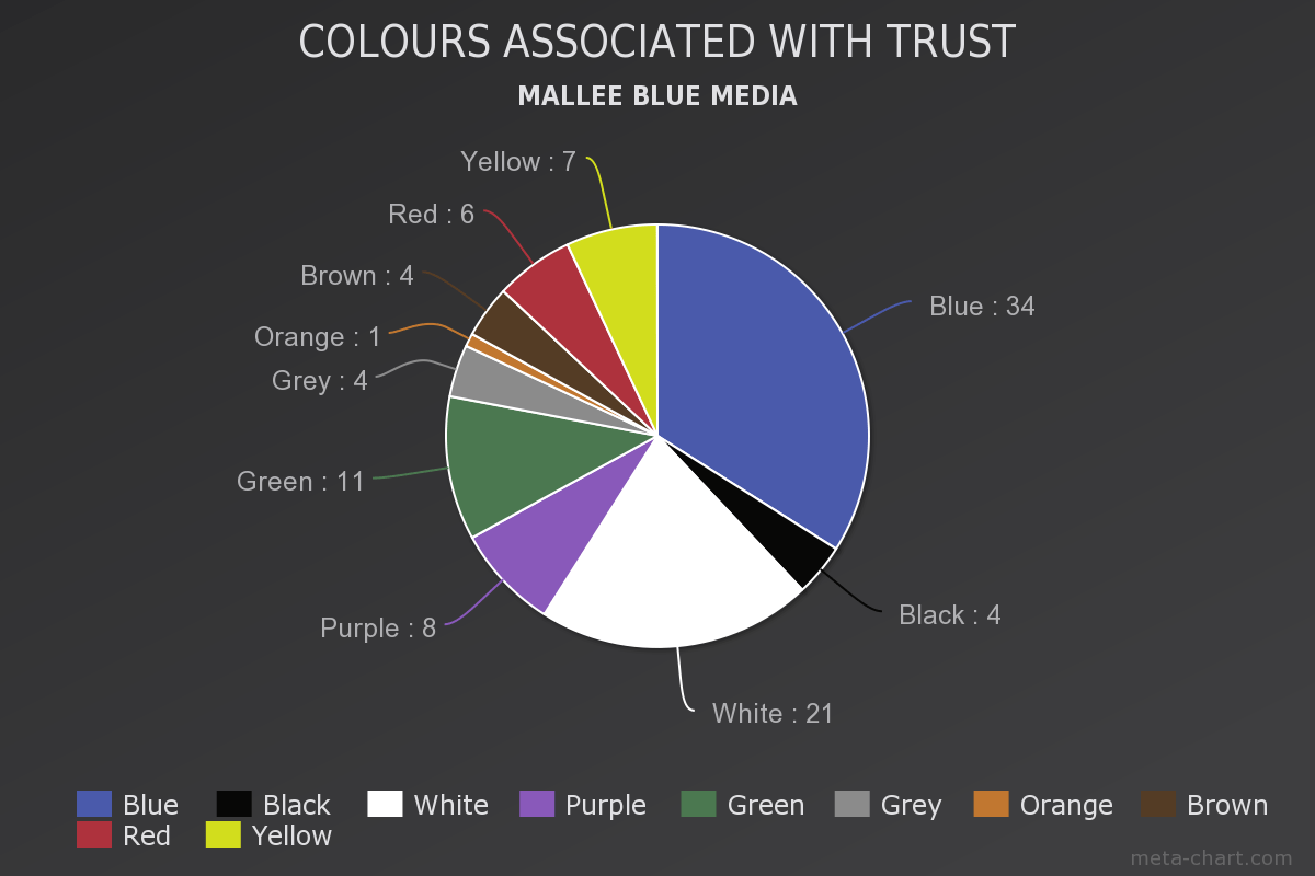
Thanks to http://www.joehallock.com/edu/COM498/associations.html for this research.
Your online store is communicating something. Not only with language, but with colours, position, style and fonts. We all have cultural as well as natural associations with various colours.
Horizontal lines tend to depict stability while vertical lines tend to evoke masculinity, strength and dynamism.
Red has a temper, is reactive and spontaneous. Got the Picture? For some nice colour combination experiments, try the ColorCombo site.

Tips on Choosing Colours for Your Website
For most websites, minimal colour is best. Two or Three Colours is plenty. Remember, you want your calls to action to stand out so:
- Only use one colour for buttons and clickable media
- Keep the colour scheme consistent. Headings that are blue today should be blue tomorrow
- Maintain plenty of white space (or, for a darker site, empty space)
Consider your Target Audience in Terms of:
- Gender
- Age
- Interests
And consider which Colours are most naturally associated with your product or service.
As a general rule, most designer begin with the 60 | 30 | 10 rule which is often used by interior designers and those in the fashion industry.
The idea is to choose three colours and use them in that ratio.
- The 60% will be the main colour of your landing page, blog or website. It’s going to be the colour that all the other colours dance around
- The 30% needs to be in stark contrast to the main theme colour.
- It’s going to be used for things like buttons and calls to action to contrast with the 60% to create a visually striking effect.
- The final 10% is your ‘accent colour’, which should complement either your primary or secondary colour.

In conventional design wisdom, it’s safer to make either the 60% or 30% a ‘neutral’ colour (white, grey, beige, black and so on). This gives you the maximum number of options when choosing your other two colours, because neutral elements will generally go with anything.
Categories:
Web Design Colour

0 comments:
Post a Comment